Minimalist Living Hall Design: A Room-by-Room Decision Guide

The floor plan is your first decision. Not the sofa color. Not the rug size. Before you buy a single piece of furniture, you need to know where people walk, where they stop, and where the eye lands when someone enters the room. Every minimalist living hall that actually works starts here — with movement, not objects.

This guide covers exactly what to keep, what to cut, and which specific products are worth the money at each stage.

Floor Plan Rules That Determine Everything Else

Minimalism in a living hall is not about owning less. It is about placing less so the space reads clearly. Two sofas arranged correctly feel lighter than one sofa pushed against a wall at the wrong angle.

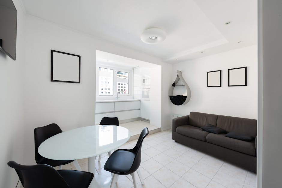
The single most important measurement: 36 inches of clear circulation path between any piece of furniture and a wall or another piece. Below that threshold, the room feels crowded regardless of how few objects are in it. Most designers use 42 inches for primary walking routes and 24 inches for secondary clearances around chairs and side tables.

Anchor everything around one focal point — either a fireplace, a large window, or a media wall. In a minimalist hall, that focal point does the work that decorative objects do in busier design styles. The HAY Mags Soft sofa (starting around £2,800) faces the focal point. Everything else is secondary or removed.

How to Test Your Layout Before Moving Anything

Use painter’s tape on the floor to map out furniture footprints before committing. A 3-seat sofa typically runs 220–240cm wide. A coffee table at 120x60cm is the right scale for most residential living halls. Tape both outlines and walk the paths. If you have to angle your body to move between furniture, the layout fails the minimalist test — regardless of what the furniture looks like.

The Scale Problem Most People Get Wrong

Buying furniture too small for the room is just as common as buying furniture too large. A 2-seat sofa in a 5×6 metre hall looks like a mistake. The BoConcept Osaka sofa (200cm wide, from £1,499) is often the better call in a medium-to-large living hall because it holds visual weight without requiring additional pieces. One well-scaled sofa reads as minimalist. Two undersized sofas read as cluttered, even when the room is otherwise empty.

The Furniture Shortlist: What a Minimalist Hall Actually Needs

Here is a direct comparison of what works and what adds noise. This is not a checklist to fill — it is a menu to edit down from.

Furniture Type Keep or Cut? What to Buy Why It Works
Primary sofa Keep Muuto Outline Sofa (from £2,200) or IKEA ÄPPLARYD (from £750) Low back, clean silhouette — does not chop the room visually
Second sofa or loveseat Cut (usually) Replace with 1–2 accent chairs if extra seating is needed Two full sofas double the visual mass instantly
Coffee table Keep one IKEA VITTSJÖ (£65) or Muuto Around side table Glass or open-frame tables reduce visual weight significantly
TV unit or media console Keep — wall-mounted preferred IKEA BESTÅ wall-mounted configuration (from £125) Visible floor space makes the room read larger
Freestanding bookcase Cut or replace String Shelving System wall-mounted (from £350) Freestanding units block the floor line and anchor mass to the wrong spots
Armchair One only, if needed HAY AAC 22 Chair (£580) or IKEA POÄNG (£120) A single accent chair adds function without adding mass
Side tables One or two small ones IKEA GLADOM (£25) or Ferm Living Sector side table Round forms soften rectilinear sofa layouts
Floor lamp One only Flos Arco Floor Lamp (£1,450) or IKEA HEKTAR (£69) One statement lamp beats three mediocre ones every time
Decorative objects Strictly limited Max 3 surfaces with objects — leave the rest completely bare Empty surfaces = visual rest, not waste

The Muuto Outline Sofa is the best pick for most minimalist halls. The back is low enough that it does not split the room in half visually, and the leg height keeps floor space visible underneath. If the budget does not stretch to Muuto, the IKEA ÄPPLARYD is the closest equivalent under £1,000 — same silhouette logic, different price point.

Vertical Space: The Most Underused Tool in Minimalist Hall Design

Most people designing a minimalist living hall think horizontally — they edit the furniture on the floor and call it done. Vertical space is where the real work happens, and it is consistently ignored.

Here is why this matters: a room with bare walls and cluttered surfaces looks unfinished. A room with thoughtfully used vertical surfaces and clear floors looks designed. The difference is not subtraction — it is redistribution.

Wall-Mounted Storage Versus Freestanding Units

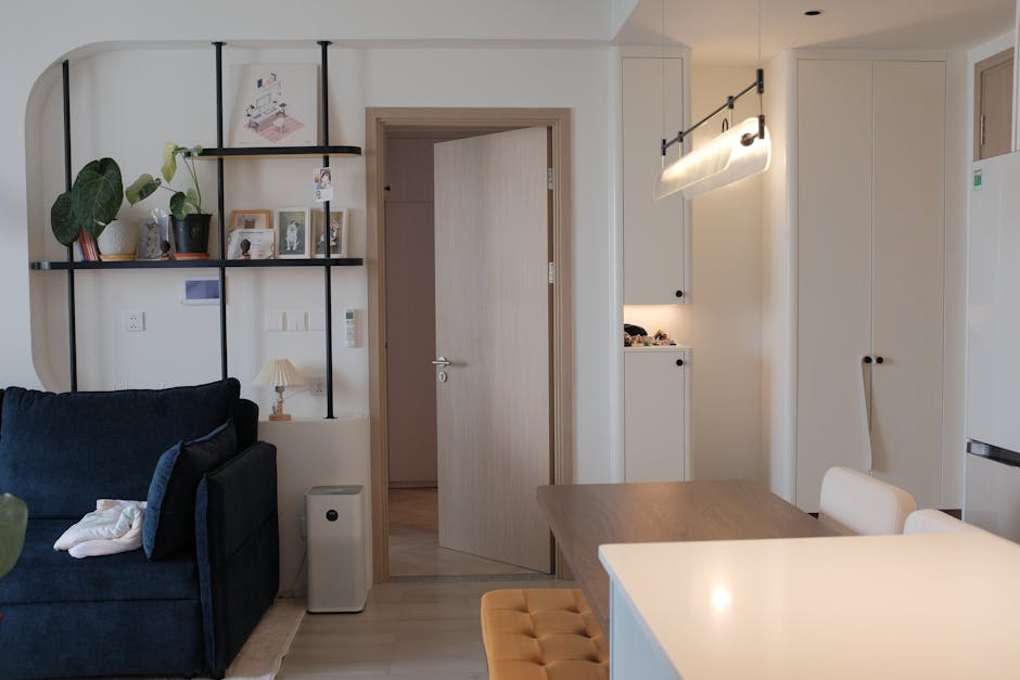
The String Shelving System (designed in 1949, still produced, starting around £350 for a starter kit) is the benchmark for minimalist wall-mounted storage. The open wire frame reads as almost invisible — your eye sees the objects resting on it, not the shelving structure itself. Compare that to a freestanding bookcase, where the unit itself becomes the dominant visual object in the room.

IKEA BILLY bookcases (from £50) are not wrong by default, but in a minimalist hall they only work floor-to-ceiling and styled sparsely. A half-height BILLY unit sitting on the floor is exactly the kind of visual interruption that makes a space read as untidy rather than considered. If you go BILLY, go full height or do not go at all.

How Much Wall to Cover

A reliable rule: cover no more than 40% of any single wall with objects or furniture. This includes art, shelves, mirrors, and wall-mounted units. In a 4-metre wall, that is 1.6 metres of covered space. The remaining 2.4 metres of bare wall does active work — it gives the covered portions room to breathe and creates the visual silence that minimalism depends on.

Large-format art on one wall is nearly always more effective than distributed art on three walls. A single 100x140cm canvas reads as intentional. Three 30x40cm prints scattered across a wall reads as undecided. Pick one wall, make one strong choice.

Shelf Styling: The Rule of Odd Numbers

Style shelves in groups of three or five objects — never two, never four. Group by height variation: one tall item, one medium, one low object. Leave 30–40% of the shelf surface completely bare. Ceramics from HAY or Ferm Living (typically £15–£80 per piece) work better than mixed collections because visual coherence — same material family, similar tone — matters more than the individual objects themselves. Variety on a shelf is clutter by another name.

The Color Decision

Warm whites over cool whites. Every time. Farrow & Ball’s Dimity (No. 2008) or Elephant’s Breath are the go-to recommendations because they read as neutral without the clinical edge that pure whites bring under artificial light. Cool whites look grey and flat by evening. Warm off-whites with a yellow or pink undertone stay soft across every lighting condition throughout the day.

Add one material accent — natural oak, raw linen, or matte concrete — to prevent the space from reading as sterile. One material thread running through the room. Not four competing textures pulling against each other.

Lighting Setup That Makes the Layout Work

Lighting is the most consistently botched element in minimalist living hall design. The typical mistake: one overhead pendant, too bright, positioned dead center. This flattens the space and highlights every ceiling imperfection. Here is the correct setup, in priority order:

  1. Demote the center overhead to fill light only. Put it on a dimmer and run it at 20–40% maximum. Use 2700K bulbs throughout — warmer than standard warm white CFLs, which typically run 3000K and feel harsh in low-ceiling rooms.
  2. Install one arc or floor lamp as the primary task light. The Flos Arco Floor Lamp (£1,450) is the designer standard for a reason — the arc positions light over seating without needing a hard-wired ceiling connection. The IKEA HEKTAR (£69) delivers the same silhouette logic at a fraction of the cost.
  3. Add low-level lighting at two points in the room. Table lamps, not uplighters. One near the sofa, one near a shelf or sideboard. Target 25–40W equivalent at 2700K.
  4. Consider wall sconces if the layout allows. The Ferm Living Vuelta Wall Lamp (£195) creates layered light without consuming floor space — which in a minimalist hall is exactly the tradeoff you want to make.
  5. Avoid recessed downlights as your only source. They produce harsh downward pools with dark zones between them. In a minimalist hall, this patchwork effect works directly against the clean visual you are building everywhere else.

Total lighting spend for a medium-sized living hall done correctly sits around £200–£600. Spending £50 on lighting while spending £2,000 on a sofa is the single most common budget allocation error in this style.

Mistakes That Break the Minimalist Look

Why Does the Room Feel Cold Rather Than Calm?

Because you edited objects but did not add warmth. Minimalism without texture reads as clinical.

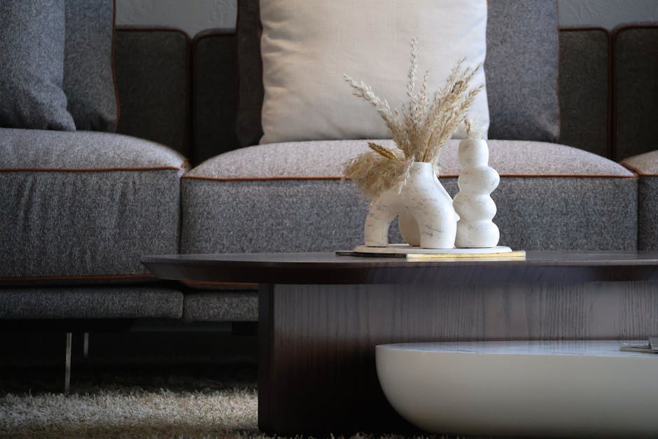
The fix is tactile layering within a tight color range: a jute or wool rug (the HAY Teppich Check Rug from £180, or a Beni Ourain-style rug for £300–£800 depending on size), linen cushions in the same tone family as the sofa, and one soft throw draped — not folded — over an arm. These additions do not add visual clutter if they stay within the same color family. They add the warmth that separates an edited room from a showroom.

Why Does It Look Empty Instead of Minimal?

Empty and minimal are different states. A minimal room has considered objects in considered positions with intentional negative space around them. An empty room has objects in default positions with accidental gaps. The difference comes down almost entirely to furniture scale and placement.

If your sofa is too small and pushed against the wall, the space looks abandoned. Pull the sofa 40–60cm off the wall. Scale up the rug so it sits under the front legs of both the sofa and the coffee table simultaneously. These two moves alone close the gap between empty and minimal for most living halls.

Is One Rug Enough?

Yes. One rug, correctly sized, always beats two rugs. The rug should extend at least 60cm beyond the sofa on both sides — for a standard 3-seat sofa, that means a minimum 240x170cm rug. The Hem Loom rug (from £450) comes in proportions that work for this and stays within a minimalist palette. Buying smaller to save money is the mistake — an undersized rug makes furniture float disconnectedly on bare floor, which is the opposite of the grounded, anchored feel minimalism aims for.

When Minimalist Hall Design Does Not Work

Families With Young Children

Minimalist halls require surfaces to stay clear. With young children, that is a daily maintenance burden that creates constant friction between the design and how the household actually functions. A more practical direction is concealed-storage-first design — everything behind closed doors, multi-functional furniture like the IKEA HEMNES daybed with storage drawers (£450) or large storage ottomans. The aesthetic sits closer to neutral Scandinavian than strict minimalist, but it meets the functional demands without requiring a daily reset of the room.

Rentals Where You Cannot Fix to Walls

Wall-mounted storage and fixed lighting are core tools in minimalist hall design. Remove them from the toolkit and the approach becomes significantly harder. In a rental, the more achievable direction is curated Scandinavian — similar color palette and furniture choices, but with freestanding storage that moves with you. The IKEA KALLAX unit (from £69) in a color that matches the wall reads as intentional rather than temporary, which is the best outcome available within rental constraints.

Halls Under 20 Square Metres

In a genuinely small living hall, strict minimalism can make the space feel more constrained, not less. There is simply not enough room to create the breathing distances between furniture that make minimalism read correctly. Multi-functional pieces — a sofa with built-in storage, a IKEA BRIMNES coffee table with storage (£130) — give better results than chasing the minimal aesthetic at the expense of function. Prioritize function first; the visual clarity follows naturally once storage is solved.

A rug that fits and furniture pulled off the walls will do more for any minimalist living hall than any individual object you add or remove.

Minimalist Living Decor: What Works and What’s Just Clutter

Three years ago I moved into a smaller apartment and had to cut my furniture list in half. I expected to feel cramped. Instead, the space felt bigger, calmer, and more deliberate than anything I’d lived in before.

That forced edit turned into an obsession — and a lot of money spent learning what minimalist living decor actually requires versus what social media calls minimalism. Here’s what stuck.

The Three Furniture Pieces That Define a Minimalist Living Room

Every minimalist living room lives or dies by three decisions: the sofa, the storage, and the lighting. Get those right and everything else fills in naturally. Get them wrong and no amount of decluttering saves the room.

The Sofa: Low Profile, Clean Lines

The sofa occupies more visual real estate than anything else. In a minimalist setup it needs to disappear into the room rather than dominate it. That means: low to the ground, straight seams, no tufting, no rolled arms that fight with everything else in the space.

The Article Sven sofa ($1,499 in charcoal or cream boucle) is the one I recommend most often. It sits at 29 inches height, runs 89 inches wide, and the tight-weave fabric doesn’t collect lint the way velvet alternatives do. The silhouette reads as intentional without being precious.

If budget is a real constraint, the IKEA SÖDERHAMN (from $899 in modular configurations) is genuinely good. Not as elegant, but the low depth works in smaller spaces and the modular system lets you reshape the footprint when you move. Avoid oversized sectionals. The visual mass they create destroys the breathing room that makes minimalist spaces feel calm in the first place.

Storage: The BESTÅ System Is Worth the Hype

The IKEA BESTÅ wall-mounted storage combination — specifically with push-open flush doors — is the single best-value piece in minimalist living decor right now. A full setup with two wall-mounted units at 120x42x38cm each runs $300–450 depending on configuration. Doors close flush. Nothing sits on top. The TV mounts directly above on the wall.

Three surfaces of clutter become one clean horizontal line. That’s the trade.

The alternative worth knowing: the String shelving system (Swedish origin, from $400 per panel). More flexible, more visible, better for books and objects you actually want to display. But it demands you genuinely curate what lives there. BESTÅ hides everything. String requires you to choose.

Lighting: This Is Where People Chronically Underspend

Overhead lighting is the enemy of a warm minimalist room. A single ceiling fixture creates flat, even illumination with no depth. The room ends up looking like a doctor’s waiting area.

The Flos Arco floor lamp (~$1,800) is the gold standard — one arc of focused light transforms a reading corner without adding any surface clutter. Too expensive? The IKEA HEKTAR floor lamp ($80) is a credible version at a fraction of the price. Point it toward the wall instead of straight down and the bounce light softens the whole space considerably.

My rule: no more than three light sources in a living room, and none overhead if you can help it.

The Visual Difference Between Minimalist and Just Empty

Interior of modern light house with glass table near chairs and couch with pillows near paintings and shelves on wall near entrance to kitchen with counter with window

Bare walls and empty floors are not minimalism. They’re absence.

Real minimalist decor has intentional texture variation. A linen sofa reads differently from concrete flooring, which reads differently from a wool rug, which reads differently from a plastered wall. That contrast is what gives the eye somewhere to land without introducing visual clutter. Strip out all texture variation and you get a space that looks like a show apartment — technically clean, completely uncomfortable to spend time in.

The interiors that actually work — from Japanese interior studios, from Scandinavian design photographers — always contain at least four different material textures in a single frame. Smooth, rough, soft, hard. Matte, reflective, woven, solid. You don’t need more objects. You need more material contrast in the ones you already own.

One practical swap with outsized impact: replace a polyester throw blanket with a Faribault Woolen Mill wool blanket (~$120). Same surface area, completely different texture density. That single change reads as more deliberate than buying three new decorative items combined.

The mistake I see most often: someone strips a room down, then panics at how cold it feels and starts adding objects back. What they actually need is softer, warmer materials in what’s already there. Raw wood tray on a coffee table. Linen cushion cover instead of polyester. Unglazed ceramic instead of painted. These are material decisions, not quantity decisions. The number of objects stays the same; the sensory experience changes completely.

How Color Actually Works in a Minimalist Space (Not All Beige)

The all-white minimalist room peaked around 2014 and fell off for a reason: it’s cold, it shows every mark, and it reads as sterile rather than calm. The rooms that actually work use warm neutrals as a base, not clinical whites.

Wall Color: Warm Over Cool

Benjamin Moore Pale Oak (OC-20) is the most-cited warm greige in minimalist interiors for good reason — it adapts well in both north- and south-facing rooms without pushing yellow. Farrow & Ball Elephant’s Breath is another reliable option: photographs well, ages well, doesn’t compete with furniture. Both read as genuinely neutral but with warmth built in.

Cool whites and blue-toned grays make furniture look like it’s floating in a void. That might photograph well for Instagram. It does not feel like a room you want to spend an evening in.

The One Accent Color Rule

Pick one accent color. Use it in exactly three places. A dusty terracotta cushion, a ceramic vase in the same family, and one art print with that tone. Done. The moment you add a fourth instance it shifts from accent to collection, and collections undermine everything else.

Colors that age best as minimalist accents: burnt terracotta, sage green, deep navy, warm rust. Colors that fight: bright yellow, coral, anything that needs its own statement moment to land.

Floors and Rugs

Pale oak or light ash floors extend the sense of space by reflecting light upward. Dark floors ground the room but make it feel heavier and smaller. If your floors aren’t changeable, a Beni Ourain rug (Moroccan, hand-knotted, $300–600 for a 5×8) adds warmth through texture without introducing color competition. The irregular natural pattern reads as organic rather than decorative, which fits a minimalist palette better than any geometric flatweave.

Five Minimalist Decor Mistakes Worth Knowing Before You Start

Elegant living room with modern decor featuring stylish vases and a cozy sofa.
  1. Buying minimalist-looking things to replace regular things. Swapping a normal bookshelf for a floating shelf system, then filling both equally. The shelf changed; the clutter didn’t. Minimalism is an edit, not a furniture style.
  2. Choosing furniture that’s too small for the space. A tiny coffee table in a large room doesn’t look minimalist — it looks unfinished. Scale matters more than quantity. One properly proportioned piece reads better than two undersized ones.
  3. Ignoring acoustics entirely. Hard floors, bare walls, minimal textiles. Sound bounces everywhere. People spend time in the room and feel uneasy without understanding why. A rug and one textile wall piece fix this in under an hour.
  4. Using open shelving for everything. Open shelves look perfect in photos for about three weeks. Then daily life happens. Closed storage with a few deliberate open displays is the sustainable version. All-open shelving requires constant daily curation to look intentional.
  5. Counting plants as decor-neutral. Plants are decor. One or two large ones — a fiddle-leaf fig, a mature monstera, an olive tree — work well in a minimalist space. Twelve small ones across every available surface is a collection, and collections work against everything minimalism is trying to do.

Storage That Disappears Into the Room

The biggest lever in any minimalist living room isn’t buying less. It’s storing better. Specifically: closed horizontal storage at or below eye level, with a designated home for everything that lives in the room.

Remotes, cables, books not currently being read, seasonal throws — if any of these doesn’t have a closed home, it ends up on a surface. And surfaces accumulate fast.

What Actually Works at Each Price Point

The Muji polypropylene storage range ($15–45 per unit) handles inside-drawer and inside-cupboard organization. Stackable, translucent, consistent sizing across the entire range. They go inside cabinets and you stop hunting for things because the system is predictable.

For visible storage that also looks considered, the HAY Colour Cabinet (small version, ~$600) justifies the price — solid doors, clean internal shelf, and the color palette means it reads as an intentional design choice rather than just a box you needed somewhere.

Together, IKEA BESTÅ handles bulk media storage, Muji handles internal organization, and HAY fills the gap where something needs to be both functional and visible. That combination covers 90% of the storage problem in a standard living room without requiring a renovation.

The Cable Problem Has a $15 Solution

IKEA SIGNUM cable management ($15) mounts under any media unit or desk and runs cables along the underside of the surface, completely out of sightlines. Installation takes 20 minutes. The visual difference in the room is significant — visible cables undo clean spaces faster than almost any other single factor.

Japandi, Scandinavian, and Classic Minimalism Compared Side by Side

Stylish modern living room and kitchen space with elegant decor and lighting.

These three aesthetics get used interchangeably online. The material requirements, color logic, and realistic budgets involved are genuinely different:

Style Core Materials Color Range Representative Brands Works Best In
Japandi Natural wood, linen, bamboo, washi paper Warm earth tones, muted sage, soft grays Muji, Ferm Living, Audo Copenhagen Small apartments, north-facing rooms
Scandinavian Minimalism Light oak, wool, brushed steel White base, pale grays, black accents HAY, String, Muuto Light-filled rooms, modern architecture
Classic Minimalism Concrete, glass, leather Monochrome, cool neutrals Vipp, Knoll, Cassina Loft spaces, high ceilings, larger budgets

Japandi is the most forgiving for imperfect spaces. The warmth of natural materials compensates for rooms that aren’t architecturally remarkable. Scandinavian minimalism needs good natural light — without it, white walls and pale oak read as flat gray and cold rather than airy and clean. Classic minimalism needs real bones. A Knoll Barcelona Chair costs $4,000 for a reason and it looks exactly like what it is. Trying to replicate that aesthetic on a mid-range budget shows immediately — the proportions are wrong, the materials feel thin, the whole effect collapses.

My default recommendation for anyone starting a minimalist living room without strong architectural features: Japandi. It’s the warmest, most achievable on a realistic budget, and the most forgiving of the objects that actual daily life requires you to keep around.

When Minimalist Decor Is the Wrong Direction for Your Space

Is a small room too limited for minimalism to read well?

Minimalism works better in smaller spaces, not worse. The problem appears when people go too bare — no rug, no warm textiles, nothing soft anywhere — and the room ends up feeling like a cell. The fix isn’t adding more objects back. It’s adding softer, warmer textures to what’s already there. A properly sized rug, adequate layered lighting, and one textile piece are often the entire solution.

What if kids or pets make clean surfaces genuinely unrealistic?

Then stop fighting your household. The functional version of minimalism for families is closed storage everywhere, fewer objects at child height, and accepting that the room will look lived-in. That’s not a failure. A home should look like people live in it.

The IKEA BESTÅ with soft-close doors becomes more useful, not less, when kids are involved. Objects vanish behind doors in seconds and the room resets. That is a more honest version of minimalism than chasing a showroom look that requires constant upkeep.

Should I purge the room completely before buying anything new?

Yes. Always. The pattern I’ve watched repeatedly: someone buys furniture with clean minimalist lines, installs it next to everything they already owned, and wonders why the room still looks cluttered. New purchases don’t create minimalism. Removal does.

Pull everything out of the space. Put back only what you would actively miss. Then look at what gaps remain. Most people find they need to buy almost nothing — they need to remove nearly everything they already have.